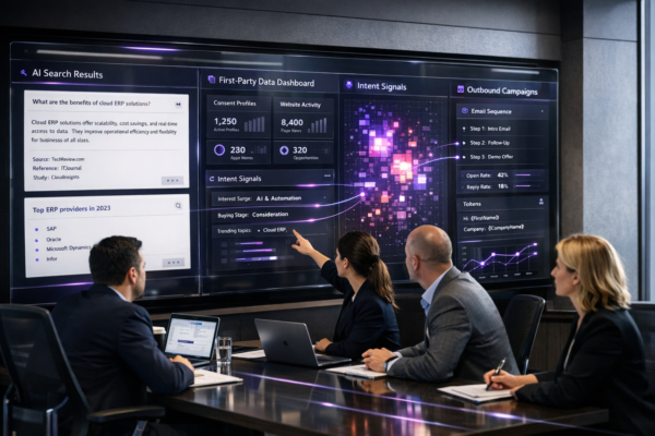
B2B email still drives pipeline—but the “inbox moment” has changed. Your prospects skim on their phones between meetings, in cabs, or while switching tabs on Teams. If your email isn’t built for mobile-first reading, you lose the click before your value even loads.
This playbook is how Way2Connect Solutions approaches mobile-first B2B email lead generation to lift clicks by ~15% through practical, repeatable improvements. No hacks. Just better experience, clearer intent, and tighter conversion paths.
Why mobile-first matters in B2B lead generation
Most B2B teams still write emails like they’ll be read on a wide desktop preview pane. In reality, mobile screens punish:
- long subject lines that get cut off
- slow-loading images
- tiny CTAs
- “wall of text” paragraphs
- links buried at the bottom
Mobile-first email isn’t about making emails shorter. It’s about making the first 3 seconds do the work: clarity, relevance, and one obvious next step.
The 15% click-lift framework: 5 levers that compound
1) The “Thumb-Stop” opening (first 2 lines)
On mobile, the preview + first lines decide everything.
Goal: In 2 lines, answer:
- Why you?
- Why now?
- What’s the next step?
Example opener (lead gen agency):
“Quick idea for reducing no-shows on booked demos. We’re seeing a simple pre-demo email tweak lift show-rates without adding steps.”
Notice: no company history, no fluff, no “hope you’re doing well.” Just value.
Tip: Use short sentences (6–12 words). Mobile readers breathe through whitespace.
2) One email = one outcome
A common click-killer is trying to do too much: pitch + case study + calendar + brochure + pricing + LinkedIn follow.
Mobile-first rule: one message, one action.
Pick ONE:
- “Read a 90-second proof page”
- “Reply with a number”
- “Choose a slot”
- “Tell me who owns this”
If you need more, sequence it across emails. That’s how you build a mobile-first B2B email funnel.
3) CTA built for thumbs (and scanners)
On mobile, CTAs fail when:
- the link is tiny
- the CTA is vague (“Learn more”)
- there are 3+ different links
The Way2Connect CTA formula:
Verb + outcome + time
- “See the 2-minute breakdown”
- “Get the checklist (PDF)”
- “Book a 15-min fit check”
Placement: Put the first CTA above the fold—usually right after the opening value line.
Bonus: Repeat the same CTA once at the end (same link, same wording).
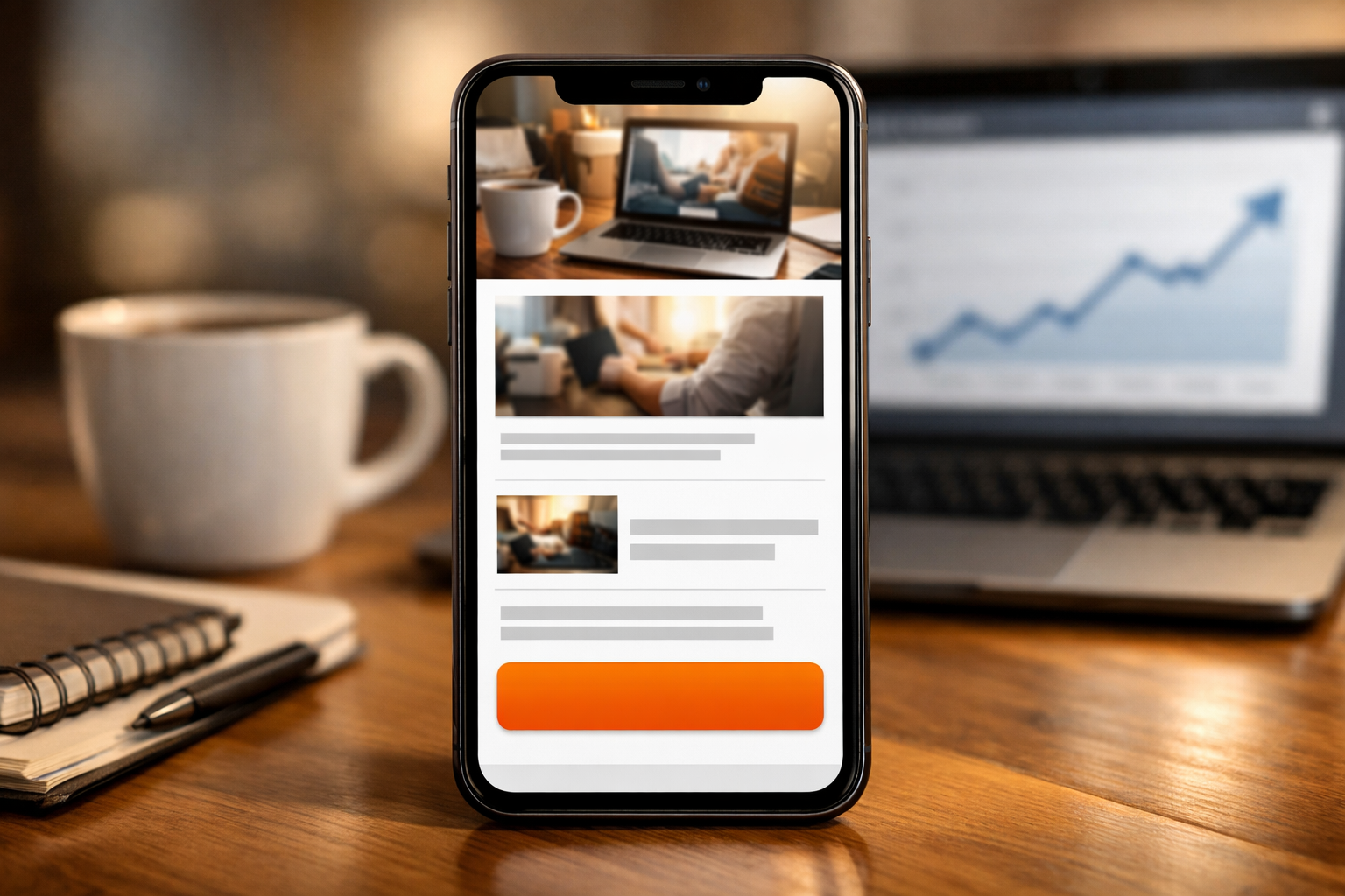
4) Design for dark mode + speed
B2B prospects live in dark mode. If your email relies on images or colored buttons, it can break.
Mobile-first best practices:
- Keep core message as text (not image)
- Avoid image-only banners
- Use high-contrast text (simple formatting)
- Keep paragraphs to 1–2 lines
- Limit to 1 supporting visual at most (optional)
Performance tip: If you include an image, compress it and keep it lightweight. Slow loads kill clicks.
5) Landing page match: “message scent”
A mobile-first email can still fail if the click leads to a heavy landing page, tiny fonts, or a mismatch in promise.
Your landing page should mirror the email:
- Same headline promise
- Same proof points
- Same CTA
- Loads fast on mobile
- Minimal form fields (or none)
Best practice: For cold outreach, try a “proof page” first (short, scannable):
- 3 outcomes
- 2 proof points
- 1 CTA
Then your next email can push the full demo.
The playbook: 7-step mobile-first email build (copy + structure)
Step 1: Subject line = clarity, not clever
Mobile truncates long subjects. Aim for 3–6 words.
Examples:
- “Quick question on outreach”
- “Idea for demo show-rates”
- “Fixing low email replies”
- “For your lead gen pipeline”
Pair with a preheader that completes the thought:
- “A 2-step tweak we use for B2B”
- “Short checklist—no fluff”
Step 2: Personalize the problem, not the person
Over-personalization (random LinkedIn trivia) feels creepy and doesn’t convert.
Instead, personalize:
- their industry
- their funnel stage
- their likely bottleneck
Example:
“Noticed many Hyderabad B2B teams are seeing reply-rates drop when emails look ‘desktop-written’.”
That’s believable and relevant.
Step 3: Use a scannable body template
Mobile-first body template (copy/paste):
- Line 1: Context + pain
- Line 2: Outcome you drive
- Line 3: Proof (mini)
- Line 4: CTA (single)
Example:
“Many B2B teams get opens but no clicks.
We optimize mobile-first emails to turn attention into actions.
Recent campaign: cleaner CTA + shorter copy improved click behavior.
Want the 10-point checklist?”
Step 4: Reduce friction with “reply CTAs”
Reply CTAs are powerful on mobile because replying is easier than filling forms.
Examples:
- “Worth sharing the checklist? Reply ‘yes’.”
- “Who owns outbound—sales or marketing?”
- “Should I send 3 subject lines we’re testing?”
These also improve deliverability signals (real replies).
Step 5: Follow-up with value, not pressure
Mobile inboxes are crowded. Your follow-up should add one new piece:
- new angle
- new proof
- new micro-asset
Follow-up example:
“Sharing a 5-line mobile-first template that’s working for SaaS + services teams. Want it?”
Step 6: Test the 3 mobile checks before sending
- Can I understand it in 7 seconds?
- Is the CTA obvious without scrolling?
- Is there only one link/one action?
If “no” to any, simplify.
Step 7: Measure what matters
Track:
- click-to-open rate (CTOR)
- mobile vs desktop clicks (if available)
- reply rate (positive replies)
- meeting conversion from clickers
Clicks are good. Qualified replies and meetings are better.
Closing: Mobile-first is the new “professional”
Mobile-first isn’t a design trend—it’s a buyer behavior reality. When you write for the small screen, you naturally become clearer, more specific, and easier to act on. That’s where the 15% click lift comes from: fewer obstacles, stronger intent.
If you want Way2Connect Solutions to apply this playbook to your outreach subject lines, copy, CTAs, follow-ups, and proof pages we can help you build a mobile-first B2B email lead generation system that converts attention into booked conversations.
Reply with your industry + target persona, and we’ll share a mobile-first template tailored to your funnel.
What does “mobile-first” mean in B2B email lead generation?
Mobile-first B2B email lead generation means writing and designing emails for phone screens first—short opening lines, scannable formatting, one clear CTA, and fast-loading links—so prospects can understand the value and take action without zooming or scrolling.
How can mobile-optimized emails improve clicks by around 15%?
Clicks improve when emails are easier to read and act on in the first few seconds. The biggest drivers are a clear first two lines, a single thumb-friendly CTA placed early, shorter paragraphs, and a landing page that matches the email promise and loads quickly on mobile.
What are the best CTAs for mobile-first cold B2B emails?
The best CTAs are simple and specific, like “See the 2-minute breakdown,” “Get the checklist,” or “Reply ‘yes’ and I’ll send it.” Keep one primary CTA per email, repeat it once at the end, and avoid multiple different links that split attention.